
Often business owners spend big bucks on stunning website design, however little thought is put into design that actually converts. Here’s some best practices for web designs that convert based on my 8 years experience running an online Marketing agency and/or Internet Marketing Coaching organisation.
Converting More Sales and Capturing More Leads
Website design that converts is about making your website more effective in terms of making sales and capturing leads. A lot of what I’m going to teach you is focused on services type businesses (so if you’re an educator or a plumber or an electrician, any of those sort of sites), not really so much for e-commerce. As we go through each of these, just write down whether or not you’ve got it, whether or not you’re implementing it, because that might help you to come up with an action list of things that you need implement on your website.
1. 10 Second Rule
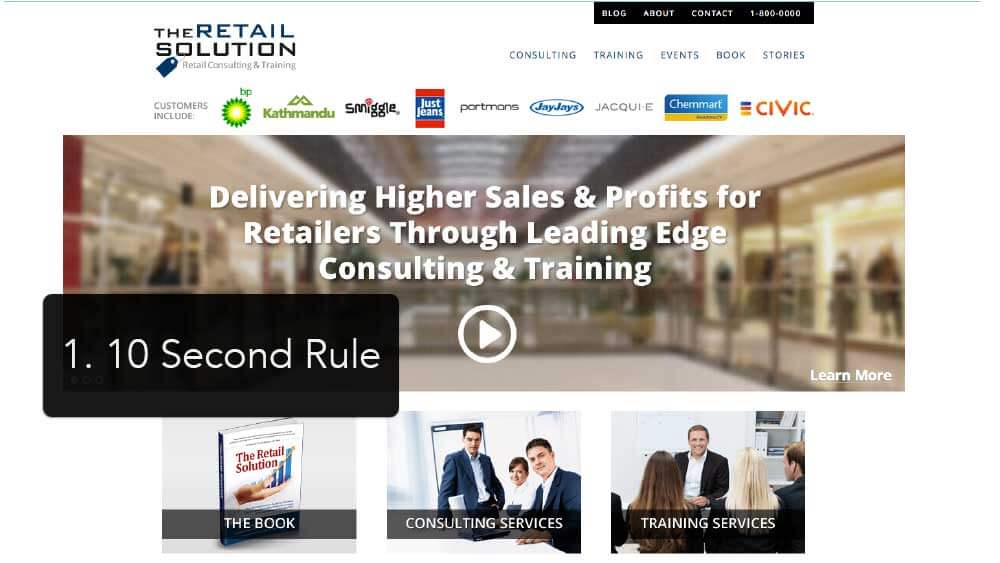
The first one is the 10 second rule. When someone first gets to your website they’re not making a ‘will-I-buy’ decision, they’re making a ‘will-I-stay or will-I-go’ decision. And the 10 second rule is probably realistically more close to five seconds these days with the way our attention span is. You’re goal is to quickly and clearly communicate who you are, what you do and also a benefit of your business or brand.
In this example, up there where it says ‘The Retail Solution’, It’s really, really quickly and easily communicating what it is. You can see the name of the business and straight underneath the logo we have a positioning statement of retail consulting and training. So think about with your logo, do you explain quickly underneath it or beside it? Who you are and what you do? For SMB, average, small, medium business, it really, really does help.
You can see also on this slide here, he’s got this main message of “Delivering higher sales and profits for retailers through leading edge consulting and training.” So it’s very, very obvious that they do consulting and training for retail type organizations. So that’s the 10 second rule.
2. Primary Course of Action
A primary course of action isn’t just needed on your homepage, it’s required on every single content page of your site as well. You’ve got to think about: ‘what is the primary course of action that I want them to take?’ on that page and also what is the secondary course of action, if there is a secondary.

So in this example where the play video button is, it says “Start here. See the benefits of mind matters for your loved ones’ brains.” This is the primary course of action for this business because they sell a really complicated service, but if you watch the one or two minute explainer video, then it clearly and simply makes sense of what they’re about.
The secondary course of action on this website is down where the junction boxes are across the bottom. Junction boxes are great at directing traffic because your home page is really more like a round about. People aren’t coming there to go in there and hang out on your home page. They go on there to solve a problem or find something that they want.

In this example above, we knew a lot of their traffic is coming from TV for the free trial offer. The primary course of action is the “Start My Free Trial Now” so we’ve got that in green so it’s very, very obvious. But we also knew that not everyone that was turning up there was ready to buy straight away or was ready to take action. So that’s why we put a secondary action there of “Learn More.” It worked really, really well.
3. Junction Boxes
On this Lawn Concepts site the ‘Which turf is right for me?’ junction box is actually the most clicked button on the site and the reason why is because people really don’t know what turf is right for them. So they click on that and then it takes them off to another like sub-junction box page of which turf is right for me?
Are you going to have a lot of shade on your lawn? Is it going to get a lot of play? Are you selling your house? Do you got grass allergies? Do you need to suppress dust, that sort of thing? So you can see how it sort of stepping you through the process. If you now chose shade because you have a lot of shade then it would take you to a page, it’s all about what are your options within shade.

So think about these within your business.
Have you got a complicated sales process and should it really be broken down into junction boxes to help them choose the right one? Because what happened here is instead of this business, people ringing up all the time saying, “I don’t know what turf is right for me.” People would ring up and say, “I need Sir Walter turf because I’ve got a lot of shade and the kids are playing on it a lot.” So your buyers are already coming to you a lot more educated.
4. Lead Magnet

A lead magnet is a good idea on every page. Traditionally as Digital Marketers, we taught that the lead magnet has to be like the free book, the free report or the free video series. But from our testing through the agency what we’ve found was the most effective for most businesses, (except for maybe just a few info marketers), was just online enquiry form with the question ‘how can we help?’ And just adding that one box to many businesses really doubled the leads that were coming through from the existing traffic without even ramping up any traffic.
We always want to focus on getting our conversion up first and then scaling out traffic. The reason why is because every time we can double the conversion of the site, we’re effectively halving the cost per lead. There’s a lot of people I meet, they’re really, really focused on, “We need more traffic. We need more traffic. We need more traffic.” Yeah, we agree, but lets do that next. Let’s get the conversion really cranking first.

Positioning of your lead magnet on the page is really important too. From an eye tracking studies, we know already how someones eyes are going to view a web page. They’re going to start at the top left and then they’re going to go across to the right. So that’s why we want the enquiry form in the right hand side bar and we know that if they get to the bottom of the page, we need to tell them what to do. So that’s why we always put ‘your next steps’ at the bottom of the page and this just really makes our Ad Words campaigns, and our Facebook campaigns more effective because we’re telling them exactly what to do.

But you can do lead magnets, the normal traditional way. I publish internet marketing magazine that goes out to a global audience now. We’ve got a lead magnet there where people can subscribe and get the magazine. And then I’ve also got another lead magnet here where it’s like a banner ad and then they click it and it goes off to what I call a Bing style landing page. What I love about these Bing style landing pages, these are just a ‘yes or yes’ close. They’re seeing conversion at 40% day in-day out because it’s sort of a sexy offer to a lot of internet marketers. The only thing with these landing pages like that one above is that there is a good chance that they are not Google or Facebook ad compliant, so be careful with your traffic sources.
5. Benefit Ridden Sales Copy Chunks

We’ve all been to those websites where you turn up and it’s just page that goes on and on of just text. A page like that is really hard to read and chances are you’re not going to stay very focused on it. So what you want to do with your sales copy on the pages just for an everyday product and service is break it up into sub-headlines and bullets. Also include images as well. Apple are the best at these where they’ve got an image up to the left and then an image down to the right and then they sort of alternate like that.
Some of the services pages that we really got converting the best are when we’ve got in the mind of the prospect and thought ‘what is it that they really want to know? What is it that they really want?’ In this example, this is a training organization and we know in the mind of the prospect they want to know what do I need to know about the training, how is it going to be delivered, how many delegates can attend and who are the trainers, that sort of thing. So you’ll notice that the sub heads actually match up with what’s in the mind of the prospect and what it is that they would want to know.
6. Video and Explainer Video

We do a lot of explainer videos where it’s like hand drawn animation or other animation. Whether your video is animated or not, you want to follow a formula when it comes to your video content which is basically stating a problem, aggravate the problem, provide the solution, add in some proof and then provide a call to action.
If you don’t know how to write the script yourself you can go to YouTube and find explainer videos that already have good scripts that you like the formula of and then go to something like Speechpad.com and give them the link to that video. They’ll then effectively transcribe it for you for like $2 or $3 and you’ve got a basis of a script. And then once you’ve got that basis of a script you can then change it to be your own script. Obviously you need to change it enough so that it’s unique. But where that was stating their problem, you’re now stating your market’s problem. Where they’re providing their solution, you are now putting your market solution.
Once you got that script down pat, you can then send it off on Fiverr, find a professional voice over audio guy to get the voice over going. And then once that’s done, send the script and the voice audio off to someone else on Fiverr who can animate it for you. In all up you’re looking at about $150 to get the professional voice over done and about $250 to get the animated video done. So all together about $400 and you’ve got someone selling for you over and over in a scripted type way. We’re finding it works really well.
7. Social Proof

Putting social proof on your website is essential and there’s many different ways of doing this. This is one of ours from our What Others Say page. We’ve got a page on our website where it’s a seemingly never-ending page of social proof. What we’ve seen with these often is that people aren’t actually even watching the video. They’re just really reading the headlines. So think about that with your own testimonials. Have you got the best bit of it in the headline or do you just have the testimonial up there because that’s very, very common. We see that all the time and it’s not as effective.

Here’s another way of doing social proof. This is Upfront Communications. We are looking at their long sales page before. It was Google friendly sales page. Where they’ve got at the top “Customers include” and then they’ve got Vodafone and Sony and Hyundai, that sort of thing. That’s social proof in itself because say for example you’re representing Optus or another big company like that, when you turn up here, this is meeting the 10 second rule really, really well if you know that this company automatically plays in the right space for you.
8. Mobile Optimized or Responsive Site
By now, most people know what responsive is, where the site adjusts itself depending on the size of the browser or the size of the screen. Responsive is great. It’s better for SEO and conversion. But for a standard services type company, it just doesn’t convert as well as a dedicated mobile site if you really want calls and leads and more people walking in the door.

Here’s an example of where a non-responsive site where we’ve mobilized it and this thing converts like crazy. You’ll can see the main call to action buttons at the top “call us,” “find us,” and “send us a quick text.” We were already doing “call us.” I love that because straight away they’re on your website and they just click it and call and they’re straight away on to the blower with you.
A phone lead is always better than an online lead because it’s a richer sales environment. You’ve got more chance of closing and moving them further down the relationship. “Find us,” I know I’m a marketing geek, but I find that really, really sexy when they can press a button and it’s going to walk clients to your door. I think it doesn’t get much better than that in marketing.
And this last one, “send us a quick text.” Google put us onto that, at the Google partner events. They said, “You’re definitely leaving money on the table. You’re not getting as many leads as possible and why don’t we add the ‘send us a quick text’ on there.” And that works really great. And so they just click that button and then it says, “Do you want to send a text to this number?” And then there would be an inquiry from the customer, which allows you to respond back and turn it from a text into an inbound phone call because the phone number that you’ve got is their mobile because they’ve already got it with them. So it’s really, really effective.
This is a home page of people’s regular businesses and we’ve got them converting it 20, 30, even up to 40% at times the home page of the business. So in this example here, you have 468 total visits for the mobile site, and of those 69 were clicks to call, 29 were click to map and 16 were clicks to text. So you can see we didn’t have a click to text on there, how many leads we were leaving.

Let’s look at how these affects PPC if you don’t have any mobile optimization going.
 This example was from a company in the weight loss space. Without the mobile site, the cost per lead was $66.87 for just dedicated traffic to mobile which wasn’t really acceptable. And then when we added the mobile site in, it went down to $0.46 lead which is amazing, isn’t it? That’s actually the biggest, most dramatic one that we did. But it also created 600 leads just out of thin air that were missing before, 600 leads a month. So a lot of money.

Your Next Steps
These 8 design elements really do have a massive impact on your website conversion. Some businesses we have grown as much as 600% just with these changes and a great Adwords campaign. So take note of which ones you currently aren’t doing or ones you think you could improve on and make an action plan to start implementing them. I’d love to hear about your businesses success from implementing any of these principles or any that you are missing that you could now implement – let me know your thoughts below.