In the past, when I’ve taught website design optimization, I focused on desktop first.
Now, with the vast majority of website traffic coming from mobile we really do need to be thinking about mobile first. Plus, Google now has two indexes. They’ve got a mobile search index and they’ve got a desktop and laptop, etc , search index. So, if you don’t do a good job on your mobile anymore, Google just stops showing you in that search result or they’ll push you way, way down the page results. That’s gonna hurt you, so mobile design really matters in 2018.
So, let’s look at some essential mobile optimization for conversion and design.
Creating/ Setting Up Your Mobile Website
Firstly, with getting a mobile version of your site, there’s three main options to do this.
1. Dedicated Mobile Site.
Say for example, you had domain.com and then you might have a dedicated mobile version at m.domain.com. Some companies still do this, like Amazon, but not many to be fair.
2. Responsive Website.
A responsive website means that it doesn’t matter whether you hit that website on a laptop, tablet or mobile device, the screen will adjust itself depending on the size of the device.
3. Mobile App
The third one, having a mobile app, is one of those things that people will say, “Oh, yeah. I’d love to have an app for my business.” An app can work if you’ve got scale or if you’ve got a lot of repeat customers coming back and they want to use the app. But as a general rule, the best option is a responsive site. So, you need a version of your website that is responsive.
The Design Elements
Let’s look at some best practices that you can do when it comes to your mobile design. This is really the responsive version of your site for when it gets down to phone form. You basically need to design for the iPhone, effectively.
Visual Menu’s
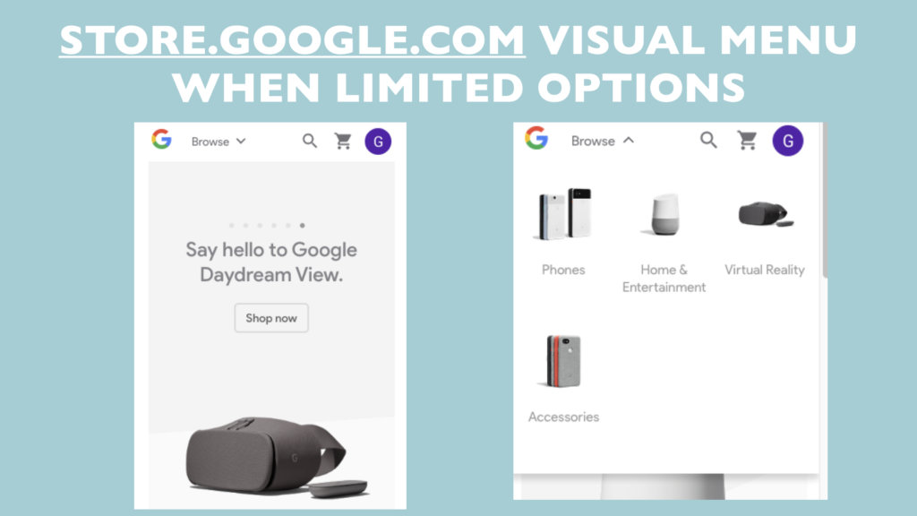
When we’re trying to figure out what’s the best practices in menu’s, why not look at what Google is doing. Makes good sense, right? So, Google has visual menus, but this works best when you have limited product options. So, if you’ve only got three or four items, you may want to have visual menus.
Sticky
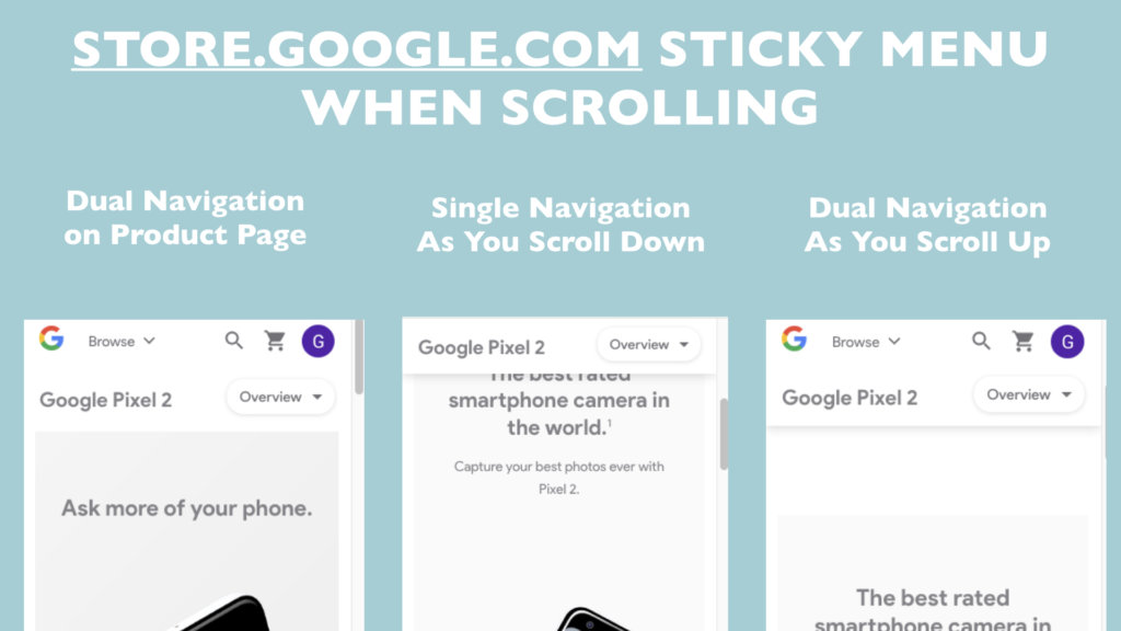
So, the other thing is one of the big learnings for us recently on mobile is sticky. So, sticky means having a menu that ‘sticks’ as they scroll down. Whereas most mobile sites, the menu disappears as you start to scroll. Keep it sticky, but think about what’s the calls to action that I really want on there?
In this example, they’ve got a dual navigation, and then as you start scrolling down, it goes to single navigation, but it still stays there. And then as you’re scrolling back up, it’s showing intent. So, they give you a bigger menu.
In this example, we have store.google.com wanting you to buy this product – The Pixel 2.
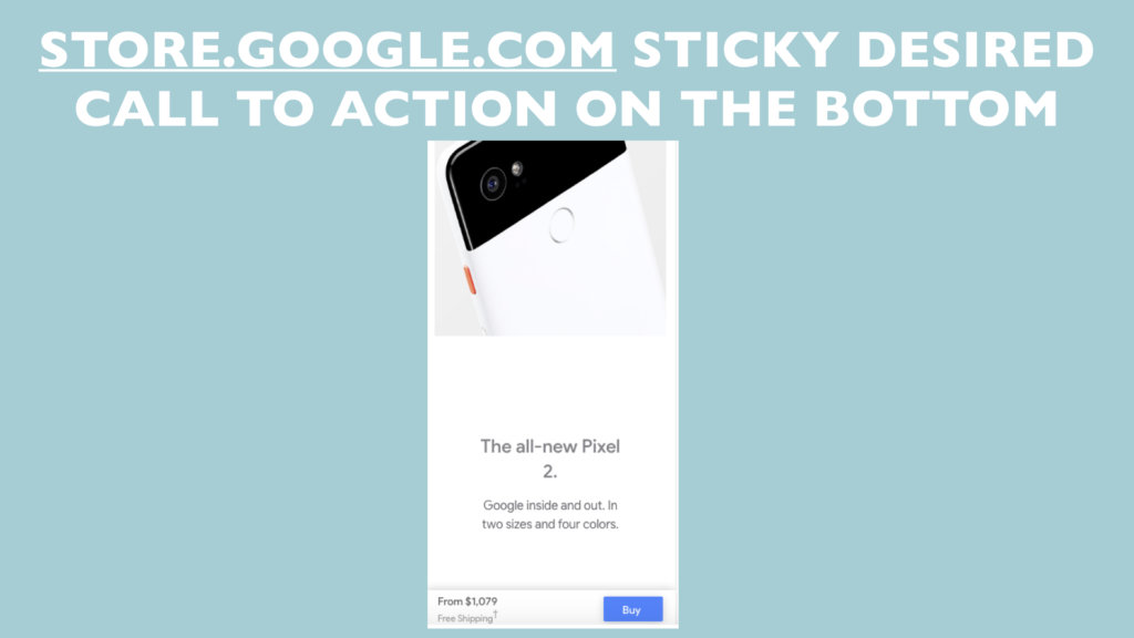
That green buy button, it stays there as you scroll down. So that when you’re ready – boom. Buy, and off you go.
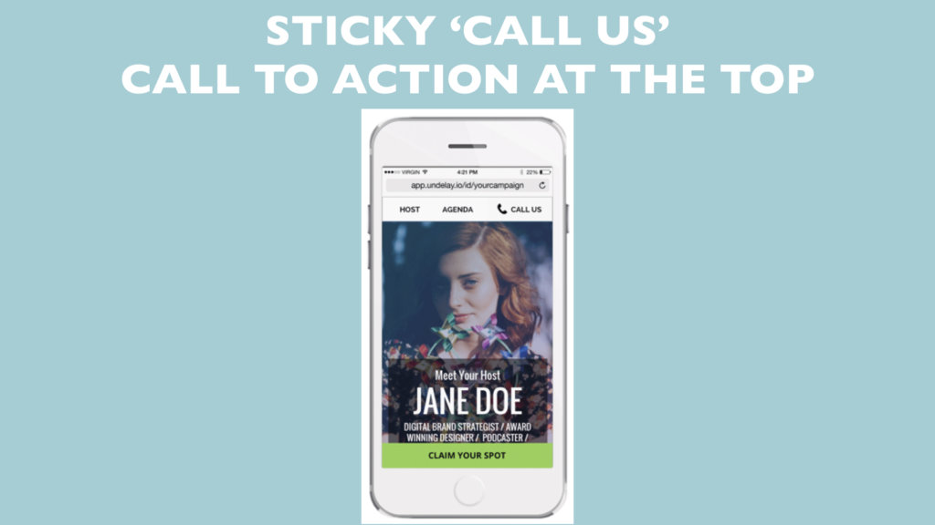
Your business might be consult request, and it’s a consult request button or free session. Figure out whatever the desired primary course of action is that you want people to take for your business…. and then can you make it sticky?
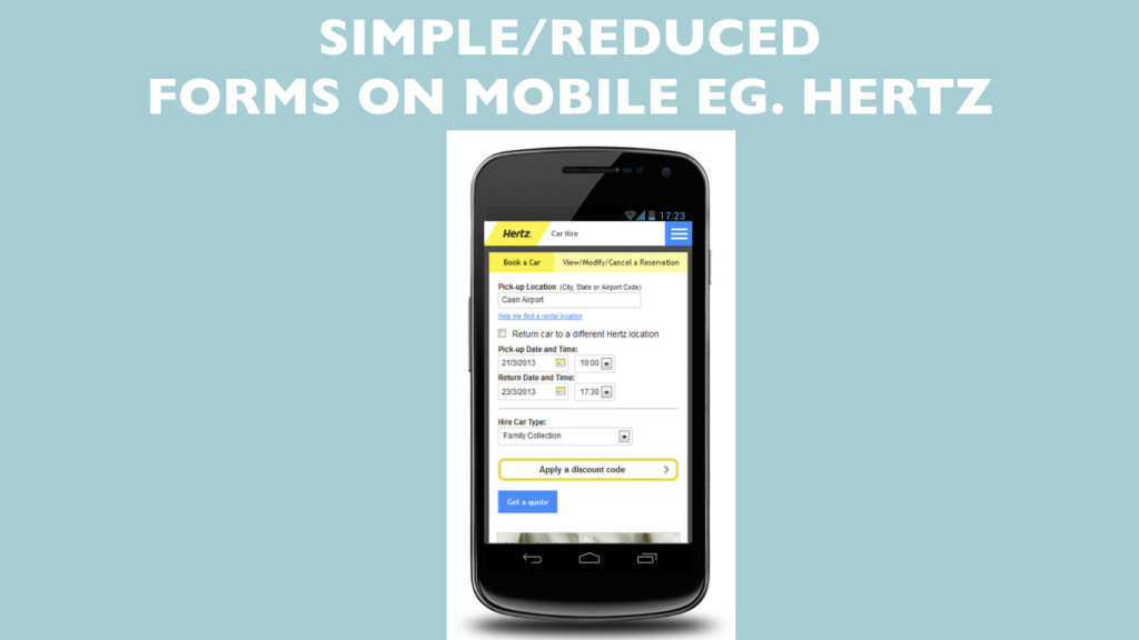
Form Optimization
Make sure your forms aren’t really long. In fact, it’s best if they’re really, really short. Sometimes, it might make most sense to do a ‘step one’ form and a ‘step two’ form. Everyone’s filled out forms on mobile, It’s not great and it can get frustrating. So you want to make it as easy as possible for people to put up their hand up and say they want to do business with you.
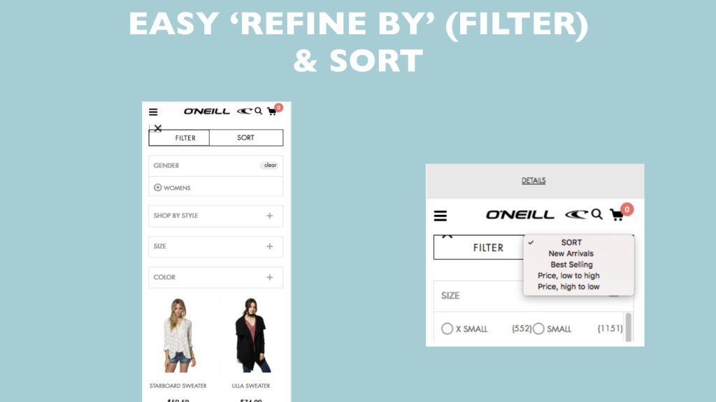
Filters
And have good calls to action like this. You know, buttons are still great, yeah, on mobile. And if you’re doing…got a lot of products, making it easy for people to filter or to sort, you know, like by best-selling and that kinda stuff. But it’s probably not as relevant to what most people are doing here.
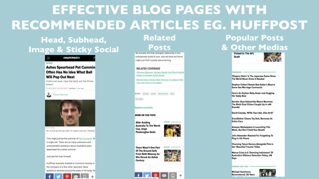
Content Display
Think about how you’re displaying your content on mobile because most of your users are consuming it this way. How does it look? Have you got a headline, a sub-headline? Have you got an image? Is the image size suitable for a mobile screen (not too big or small for example). Then when they get to the end of your article or blog post, is there ways that they can keep consuming more of your content? We want them to stay on the site longer. We want them to ‘know us, like us, trust us’, more and more and good way to encourage that is to easily have links off more relevant and quality content they can consume.
Site Speed
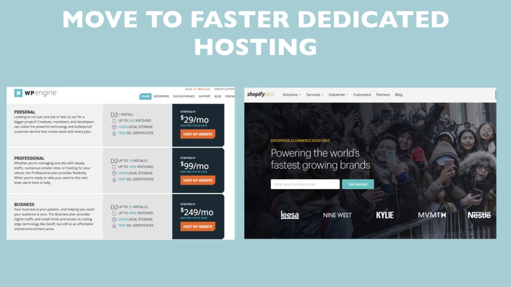
Speed matters more than anything with mobile design. There’s a fast hosting that we use called WP Engine. So, Pretty much every one of our clients who are using WordPress, we’ve cut over to that now, because they’ve now also got Australian hosting as well. It’s pretty amazing in that the amount of time that it takes a website to load, pretty much halves. So, if it took eight seconds before, which is unacceptable, getting it down to four can really make a difference.
There are other things you can do to increase site speed, you can ‘hide’ your images, so that the whole page loads faster. You can compress the file size, because they really don’t need to be massive.
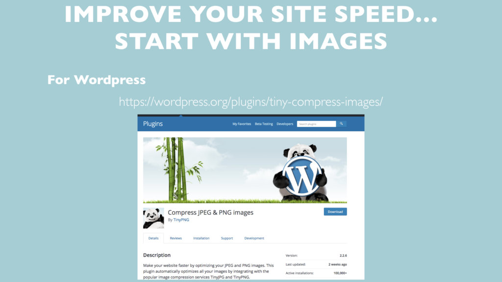
There’s a WordPress plugin called Compress JPEG and PNG Images by Tiny PNG, and it’ll go through and it’ll analyze every image that’s on your website, and make a smaller version of them. As a result, your website’s going to load faster because it doesn’t have to load big images all the time. So, it’s really, really cool.
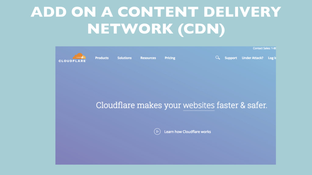
Content Delivery Network
If you convert to WP Engine as a provider, you don’t even need this because they’ve got this covered for you. Content delivery network is just basically talking about this: you’ve got your main website, it will figure out where all the people coming from, and it will cache it, meaning having a copy of your website out in places that are closer to where your end users are. Or it will cache your images so they load faster. By doing this, essentially everything loads faster, that’s what a content delivery network is.
So that’s basically the crux of what you need to be doing with your mobile site in 2018 to improve your conversion and ranking. Are you doing any of these yet or is your site falling way behind? I’ll leave it with you. Have a great day.